UrbanMove
Creating Smarter
Safer Journeys
Problem
NYC’s daily commute is plagued by unreliable updates and safety concerns, making it stressful and unpredictable for millions of commuters.
Solution
We designed UrbanMove to bring clarity and confidence to NYC commuting by improving real-time updates and integrating safety-focused features.
My Role
UX Researcher and Designer
Team of 2
I focused on one flow out of the two in the app
Scope
3 months
Q3, 2024
Project as a part of the HCI course at Cornell University


The Problem
Transforming NYC's Unreliable and
Stressful Commutes
Commuting in New York City is a daily challenge for millions. With unreliable real-time updates, frequent delays, and safety concerns during off-hours, getting around often feels like a guessing game. Whether it's the subway, buses, or walking, the lack of reliable information leaves commuters frustrated and unprepared for the unexpected.
Real-time transit updates are often inaccurate, causing confusion.
Safety concerns arise in isolated stations and late-night commutes.
Navigation tools frequently misguide users on station exits and routes
Research
Uncovering Insights
Understanding NYC Commuters
Researching NYC commuters isn’t just about asking questions—it’s about experiencing the chaos firsthand. To dig deep, we used a mix of methods to uncover pain points that make every trip an unpredictable adventure.

Pain Points
The Daily Struggles
Participants described feeling frustrated and skeptical about real-time transit updates. One shared how Google Maps often showed inaccurate train schedules, leaving them staring at an empty track despite the app claiming a train was “arriving.” Others noted that underground navigation was especially unreliable, making them hesitant to trust the apps entirely.
Guessing Game of Real Time Updates
Safety Gamble of Late Night Commutes
Wrong Exits and Wrong Turns
Chaos of Unexpected Reroutes
Apps that let you down Underground
The User and Their Story
Susan, 27, is a marketing professional working late hours in NYC. She relies on public transit but feels unsafe navigating empty train cars and less secure stations at night.
Susan seeks a solution to avoid unsafe routes, share her live location with friends, and commute home safely with less stress.


Solution
How Might We’s ? 🤔
After the research, we identified multiple pain points. However, due to the scope of the project, we decided to focus on the top two: real-time updates and safety
How might we enhance commuter safety by providing secure route suggestions and live location sharing during late-night travel?
How might we deliver accurate, real-time updates to help users navigate delays and changes with confidence?
I primarily worked on addressing safety-related challenges, as tasks were divided between the two team members.
Feedback and Iterations
Testing these with participants was eye-opening—they navigated safer routes and shared their location, but their feedback revealed gaps like unclear safety indicators and hard-to-spot buttons. These insights helped us tweak the design before going digital!

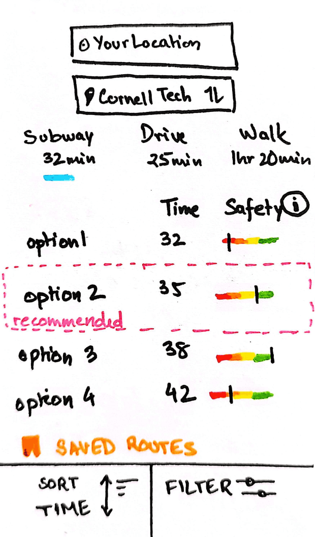
Participants asked for more personalized options, so we introduced “saved routes” and a “recommended route” feature to help users quickly pick paths they trust or prefer.

Before
After
info
button
recommended
route
saved
routes

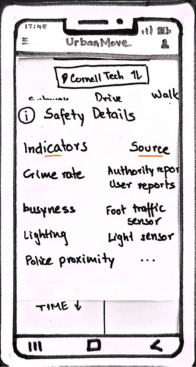
Participants wanted clarity on safety indicators, so we added an “info” button to explain the criteria and data source, making it easier for users to trust the app.
Participants wanted to see popular routes, so we added a “sort by popularity” option, making it easier to follow commonly used, safer paths.
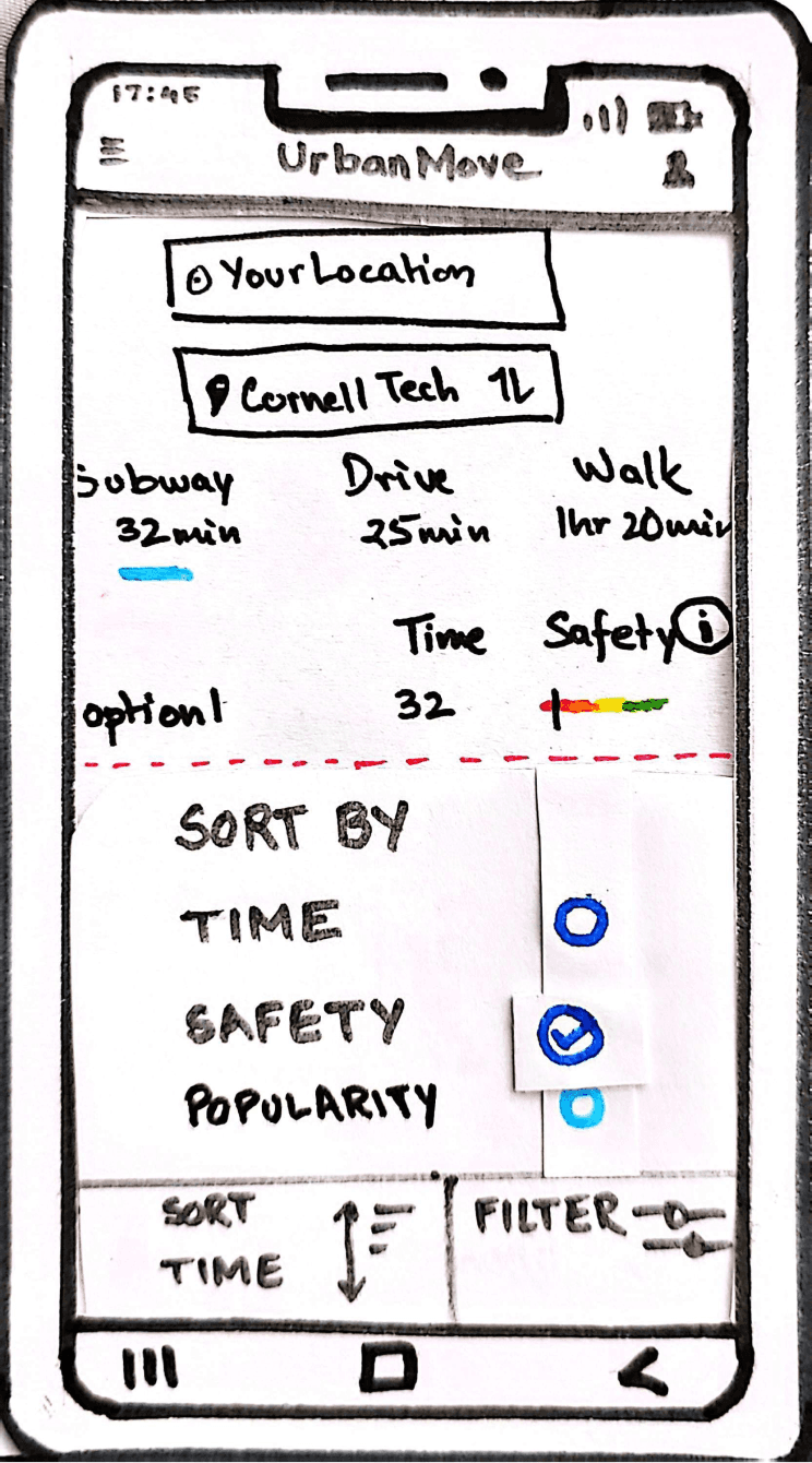
Sort by
User Popularity
Before
After


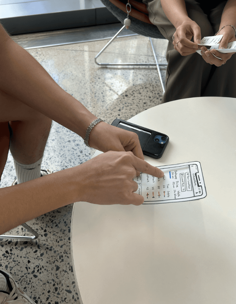
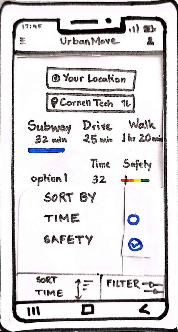
Paper Prototyping and Testing
From Scribbles to Solutions
We sketched out key features like safer routes and live location sharing to bring our ideas to life quickly.

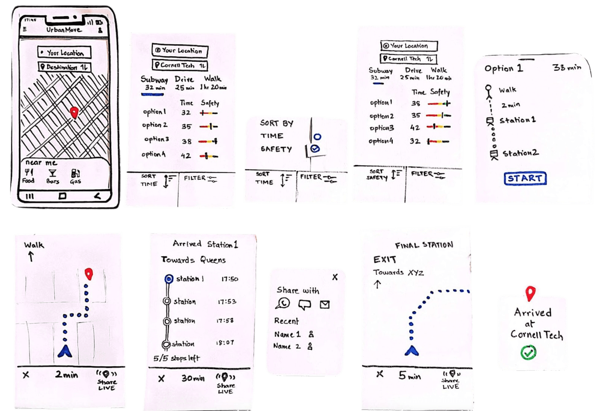
Digital Prototyping
Going Digital to Bring Ideas Alive
After the improved paper wireframes were finalized, it was time to create the digital prototypes

Recommended Route is shown for quick decision making based on an optimal choice between time and safety
Sort by options give the user the choice to assess and compare routes according to time, safety and popularity amongst other users


Track between the stations inside the subway so that the user never feels lost or confused about which stop to get off at
Track between the stations inside the subway so that the user never feels lost or confused about which stop to get off at
Share Live Location with your trusted contacts so that they can track your movement and let you be at ease
Share Live Location with your trusted contacts so that they can track your movement and let you be at ease


Check the safety history of an area
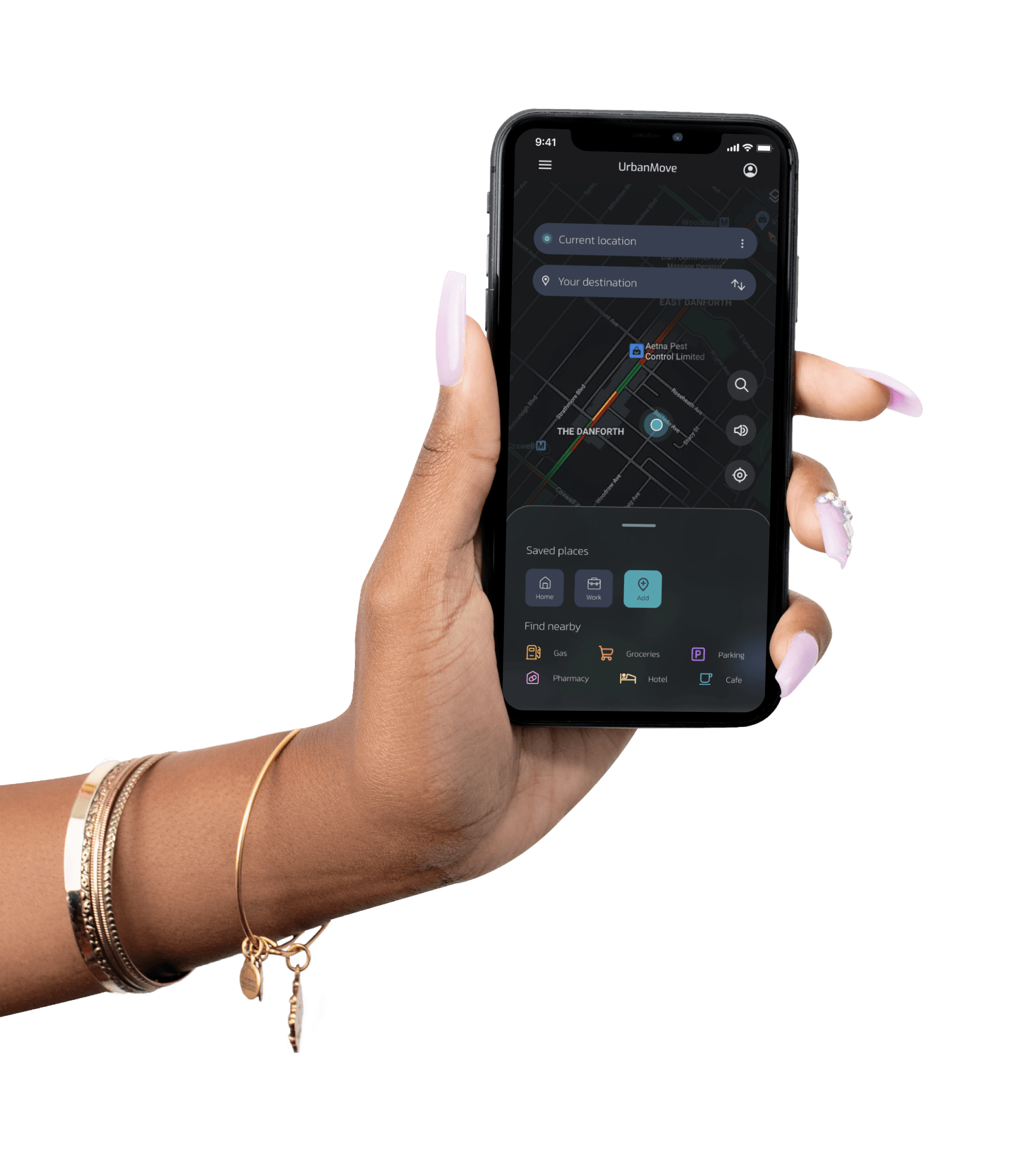
Desktop
For the desktop version, we gave UrbanMove more breathing room—bigger maps, clearer layouts, and all the info you need at a glance. With extra space to play with, we made navigation smoother and features like route sorting and safety indicators easier to access.

Watch
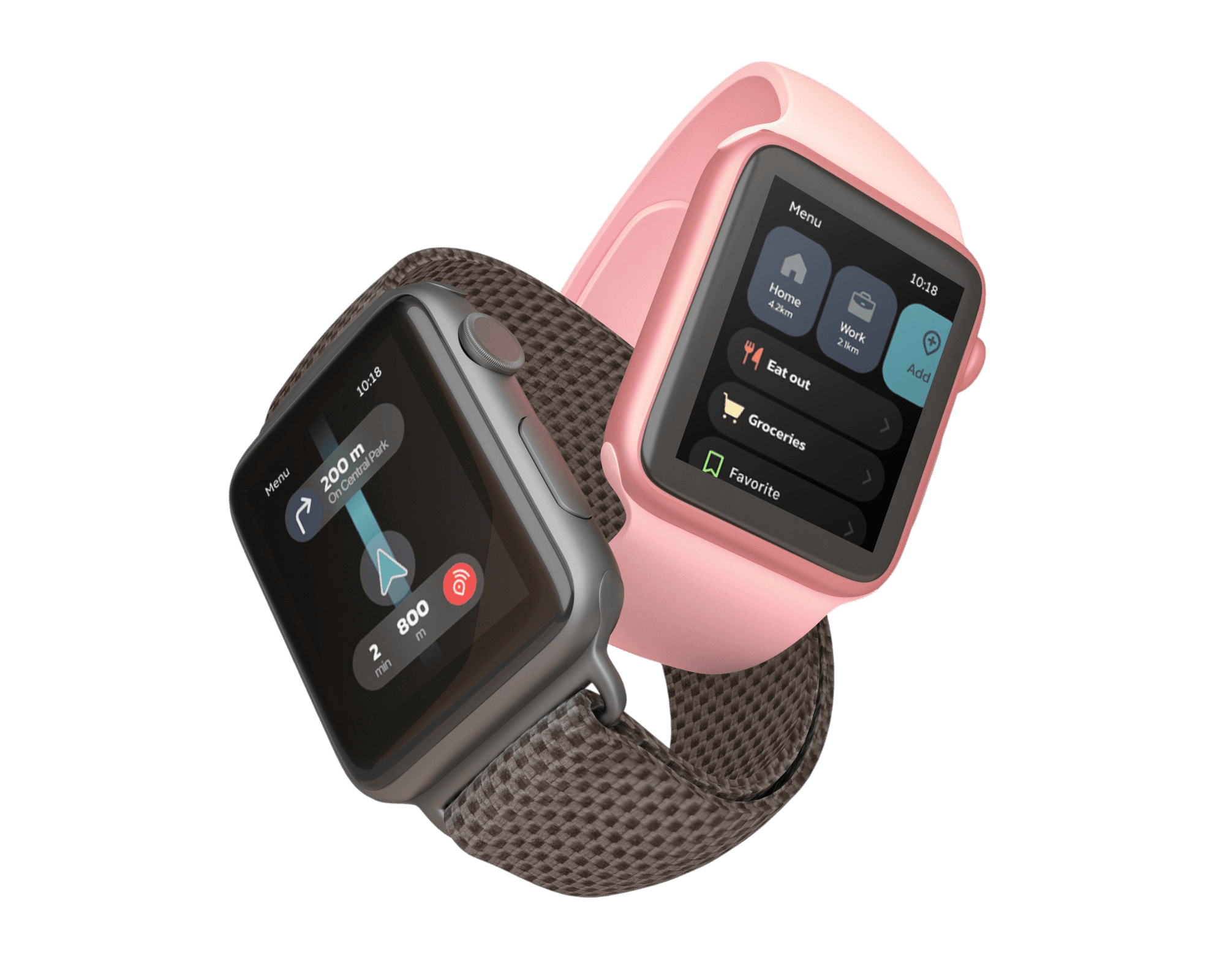
The watch version is all about quick actions and essential info, perfect for when you’re on the go. We kept it simple with big, tappable buttons and clear visuals, so you can check routes, get safety alerts, and share your location in just a few swipes.

Watch
The watch version is all about quick actions and essential info, perfect for when you’re on the go. We kept it simple with big, tappable buttons and clear visuals, so you can check routes, get safety alerts, and share your location in just a few swipes.
Visual Identity
Crafting the Look with a Custom UI Kit
Our complementary brand colors bring energy and balance, along with vibrant secondary shades for playful icons. A dark background keeps things sleek and easy on the eyes, letting the colors pop, while neutral text ensures readability. Bold, fun, and distinctly UrbanMove!

UI Components
Functional, Approachable, and Sleek

Typography

Key Takeaways
So, What did We Learn ?
From interviews to designs, here’s what I learned along the ride
The Power of User Feedback
Testing early prototypes with real users revealed critical gaps I hadn’t anticipated and emphasized the importance of iterating based on their needs.
Prioritizing Clarity in Design
Even seemingly simple features, like safety indicators or buttons, need to be intuitive and well-explained for users to trust and engage with them.
Adapting Designs for Different Platforms
Each platform has unique constraints. I learned how to tailor user interfaces to fit screen sizes, user behaviors, and interaction methods, ensuring functionality and usability across all devices.
UrbanMove
Creating Smarter
Safer Journeys
Problem
NYC’s daily commute is plagued by unreliable updates and safety concerns, making it stressful and unpredictable for millions of commuters.
Solution
We designed UrbanMove to bring clarity and confidence to NYC commuting by improving real-time updates and integrating safety-focused features.
My Role
UX Researcher and Designer
Team of 2
I focused on one flow out of the two in the app
Scope
3 months
Q3, 2024
Project as a part of the HCI course at Cornell University
The Problem
Transforming NYC's Unreliable and
Stressful Commutes
Commuting in New York City is a daily challenge for millions. With unreliable real-time updates, frequent delays, and safety concerns during off-hours, getting around often feels like a guessing game. Whether it's the subway, buses, or walking, the lack of reliable information leaves commuters frustrated and unprepared for the unexpected.
Real-time transit updates are often inaccurate, causing confusion.
Safety concerns arise in isolated stations and late-night commutes.
Navigation tools frequently misguide users on station exits and routes
Research
Uncovering Insights
Understanding NYC Commuters
Researching NYC commuters isn’t just about asking questions—it’s about experiencing the chaos firsthand. To dig deep, we used a mix of methods to uncover pain points that make every trip an unpredictable adventure.
Pain Points
The Daily Struggles
Guessing Game of Real Time Updates
Participants described feeling frustrated and skeptical about real-time transit updates. One shared how Google Maps often showed inaccurate train schedules, leaving them staring at an empty track despite the app claiming a train was “arriving.” Others noted that underground navigation was especially unreliable, making them hesitant to trust the apps entirely.
Safety Gamble of Late Night Commutes
Participants highlighted late-night safety concerns as a major issue. One described feeling "extremely unsafe" in a deserted subway station late at night, while another mentioned sticking to busier, well-lit areas to avoid potentially risky situations. The consensus? Many commuters feel anxious and vulnerable during off-peak hours, prioritizing safety over convenience.
Wrong Exits and Wrong Turns
Participants expressed frustration with apps frequently directing them to the wrong station exits. One commuter shared how they often ended up on the opposite side of the street or in an unfamiliar area. “I just get out wherever and figure it out from there,” one participant admitted, highlighting the lack of trust in navigation tools for accurate exit guidance.
Chaos of Unexpected Reroutes
Unexpected train changes were a common source of stress. One participant described the chaos of realizing mid-commute that their train wasn’t stopping at their intended station, forcing them to scramble for alternatives without clear instructions. The lack of rerouting guidance made these situations feel like high-stakes guesswork.
Apps that let you down Underground
Participants noted that transit apps often fell short of expectations. One commuter bluntly stated, “I’d rather memorize my route and wing it,” citing outdated information and buggy interfaces as key frustrations. The unreliability of apps underground drove many to rely on memory and physical signs instead of technology.
The User and Their Story
Susan, 27, is a marketing professional working late hours in NYC. She relies on public transit but feels unsafe navigating empty train cars and less secure stations at night.
Susan seeks a solution to avoid unsafe routes, share her live location with friends, and commute home safely with less stress.
Solution
How Might We’s ? 🤔
After the research, we identified multiple pain points. However, due to the scope of the project, we decided to focus on the top two: real-time updates and safety
How might we enhance commuter safety by providing secure route suggestions and live location sharing during late-night travel?
How might we deliver accurate, real-time updates to help users navigate delays and changes with confidence?
I primarily worked on addressing safety-related challenges, as tasks were divided between the two team members.
Feedback and Iterations
Testing these with participants was eye-opening—they navigated safer routes and shared their location, but their feedback revealed gaps like unclear safety indicators and hard-to-spot buttons. These insights helped us tweak the design before going digital!
Participants asked for more personalized options, so we introduced “saved routes” and a “recommended route” feature to help users quickly pick paths they trust or prefer.
Before
After
info
button
recommended
route
saved
routes
Participants wanted clarity on safety indicators, so we added an “info” button to explain the criteria and data source, making it easier for users to trust the app.
Participants wanted to see popular routes, so we added a “sort by popularity” option, making it easier to follow commonly used, safer paths.
Sort by
User Popularity
Before
After
Paper Prototyping and Testing
From Scribbles to Solutions
We sketched out key features like safer routes and live location sharing to bring our ideas to life quickly.
Digital Prototyping
Going Digital to Bring Ideas Alive
After the improved paper wireframes were finalized, it was time to create the digital prototypes
Recommended Route is shown for quick decision making based on an optimal choice between time and safety
Sort by options give the user the choice to assess and compare routes according to time, safety and popularity amongst other users
Track between the stations inside the subway so that the user never feels lost or confused about which stop to get off at
Share Live Location with your trusted contacts so that they can track your movement and let you be at ease
Check the safety history of an area
Desktop
For the desktop version, we gave UrbanMove more breathing room—bigger maps, clearer layouts, and all the info you need at a glance. With extra space to play with, we made navigation smoother and features like route sorting and safety indicators easier to access.
Watch
The watch version is all about quick actions and essential info, perfect for when you’re on the go. We kept it simple with big, tappable buttons and clear visuals, so you can check routes, get safety alerts, and share your location in just a few swipes.
Visual Identity
Crafting the Look with a Custom UI Kit
Our complementary brand colors bring energy and balance, along with vibrant secondary shades for playful icons. A dark background keeps things sleek and easy on the eyes, letting the colors pop, while neutral text ensures readability. Bold, fun, and distinctly UrbanMove!
UI Components
Functional, Approachable, and Sleek
Typography
Key Takeaways
So, What did We Learn ?
From interviews to designs, here’s what I learned along the ride
The Power of User Feedback
Testing early prototypes with real users revealed critical gaps I hadn’t anticipated and emphasized the importance of iterating based on their needs.
Prioritizing Clarity in Design
Even seemingly simple features, like safety indicators or buttons, need to be intuitive and well-explained for users to trust and engage with them.
Adapting Designs for Different Platforms
Each platform has unique constraints. I learned how to tailor user interfaces to fit screen sizes, user behaviors, and interaction methods, ensuring functionality and usability across all devices.